Friday 23 April 2010
Sign & Digital.
Although i changed my mind about the laser cutting idea i recently went to Sign & Digital exhibition at the NEC and saw examples and found it useful. The exhibitors gave demonstrations and answered my question of what other materials can be used to laser cut. If i had attended the show before we had decided on our final design then i probably would have pushed the idea of laser cutting more as it is something i haven't tried and look effective.Below are laser cut cogs from the show. They demonstrate how well an intricate design could look if it was laser cut.

Thursday 22 April 2010
Wednesday 21 April 2010
Rectifying The Problems.
With a little bit more patience and fabric we continued to sew the blocks. Although some are not straight and have been re-sewn numerous times and with no fabric left they have had to stay on the final garment, this is a little disappointing after the amount of planning and effort that we have put into constructing the dress. The only factor we can pin point why some blocks wouldn't work is the choice of fabric, this is because when making the toile the only ones that were slanted were the first ones we attempted. We have decided to make buckram boxes to slot inside to try uphold the shape and hopefully take the attention away from odd blocks not being straight.
Monday 19 April 2010
Problems Fabric.
We have started to sew our front panels together to create the blocks however none of the blocks seem to be working out. Even though all the notches match up the blocks seem to still turn out wonky. We have had to re-cut a few pieces as they had been mitered too much and so was impossible to work with. I think the fibre content of the fabric also has a part to play, as it is made up with 2% of Lycra yet we didn't anticipate it affecting the process as much as it has. We have found that the fabric tends to slip and stretch in the wrong places. We have checked with the samples that we had previously before ordering and believe we were sent the wrong fabric.
Tuesday 6 April 2010
Size Of Blocks.
To choose the size of the blocks that will eventually be sewn for the final garment we constructed a range of pattern sizes: 3x3cm , 4x4cm and 5x5cm. The first we attempted was the 5x5 size, we were pleased with but after completing 4x4 size we decided this was the perfect size to suitably fit a word onto the dress. As a challenge to ourselves we experimented with a 3x3 size, this was a lot more difficult than anticipated and the overall look wasn't as impressive and eye catching as the 4x4 size. Below are some images taken from the toile of the 4x4 boxes.


Friday 2 April 2010
Fabric.
Due to the nature of the garment a weighty fabric is needed. One that when sewn will hold the shape of the blocks. As our colour palette is white as so not to take attention from the blocks we have decided cotton or a cotton mix would be best. For example after fabric researching we found a 98% cotton and 2% Lycra consistency. It felt hard wearing and exactly what we were looking for. As a back up plan if the blocks do not stay after being pressed then we will invest in some buckram. This is used in all types of clothing as a stiffener and so this would help achieve our expected silhouette.

Silhouette.
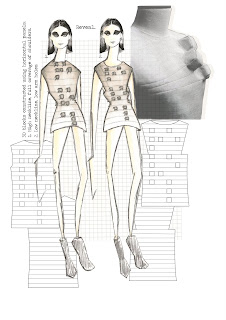
Before collaborating i had envisaged the design to use the method of subtraction cutting and so i was expecting the silhouette to be random and unexpected. However after discovering Nakamichi's pattern cutting methods and talking over Suzanne's concept i feel that a slick structured dress is the way forward. This is so that the blocks stand out more and aren't overwhelmed by the subtraction cutting. We have discussed adding gussets to either side of the dress to accentuate the silhouette more.
Thursday 1 April 2010
Ideas For Word To Go On Garment.
As braille is made up from up to six dots per a letter a fairly short word is needed as it can only fill a certain area on the front panel pieces...{hidden}{decipher}{reflection}{reveal}{distortion}{decode}{secret}{conceal}{expose}
Looking back at the design we felt it was best to stick with a 6 letter word as this would fit perfect onto the front. Decode was the chosen word, the word is spelt in lower case as another dot is needed to signify it starts with a capital letter, this means the formation of the letters wouldn't be as effective.
Looking back at the design we felt it was best to stick with a 6 letter word as this would fit perfect onto the front. Decode was the chosen word, the word is spelt in lower case as another dot is needed to signify it starts with a capital letter, this means the formation of the letters wouldn't be as effective.
Collaborating Ideas.
After researching into our own concepts we drew key points from them so that we could create a garment which fused both ideas. In the beginning it was quite difficult to mix our ideas however after i found Pattern Magic by Tomoko Nakamichi we took inspiration from his innovative cutting methods. The pattern that stood out the most was on the front cover of volume 1. The 3 dimensional shape that is created is very aesthetically pleasing. It fitted so well with our concepts as the blocks looked like they were forms of braille yet we could focus on the shadowing caused by the blocks.
Subscribe to:
Posts (Atom)


